Case Study - SOLAS.
|
|
Logo design.The challenge.
The SOLAS Board of Directors and senior management wanted a contemporary logo that was easily read in multiple formats. The result. The SOLAS logo is simple and easy to read. By using the existing colour palette, the clients who have known SOLAS for the past 20 years still had consistency and familiarity. |
|
|
Brochure design and print.The challenge.
To design a brochure that introduces SOLAS. The result. The SOLAS brochure is A3 folded to A4, giving a brief outline of the various services offered by the not-for-profit organisation. We chose this format to make it easy to be posted, included with other formal documentation and cost effective to print. The feedback from clients of SOLAS has been positive, with clients of one service, now aware of another. In addition, it has been easier to introduce the wide variety of services offered by SOLAS to new clients and interested parties. |
|
|
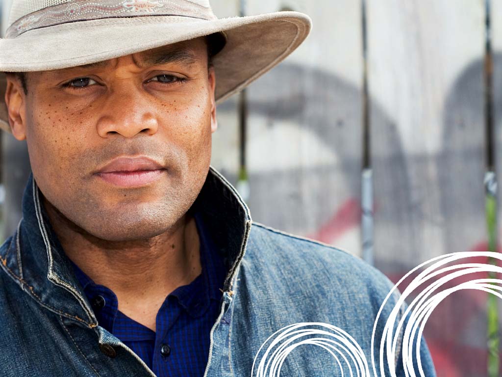
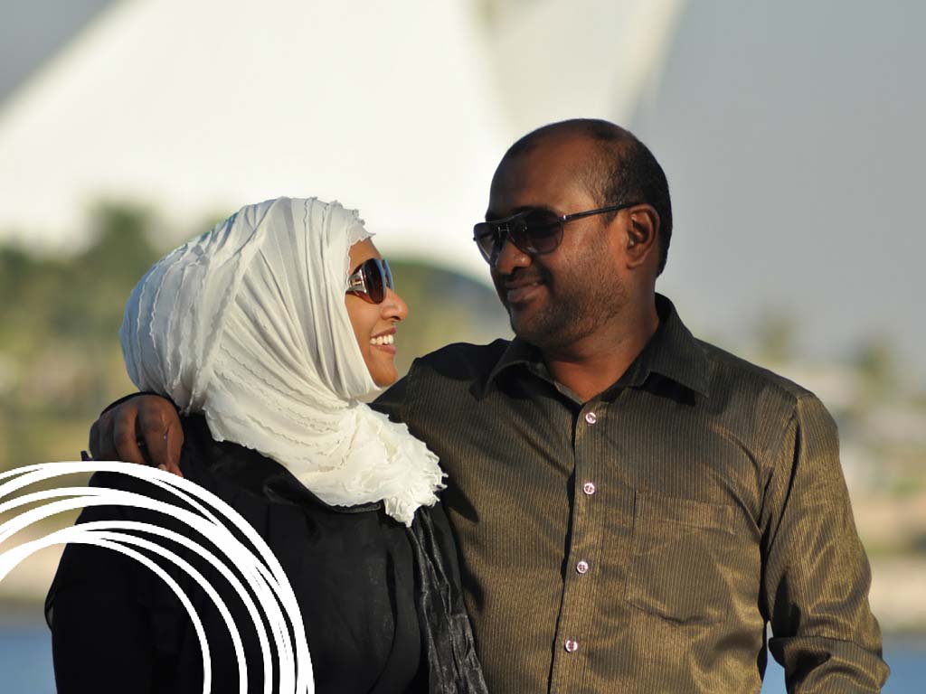
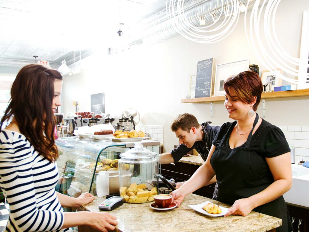
Image bank.The challenge.
To create a bank of images for use by office staff and graphic designers. The result. A bank of diverse images with a common design element to tie them all together and make them 'SOLAS' images. Stock images were purchased and professional photographs were taken to create this group of images. These are now used in social media, printed brochures, on the website and in the office. |